Gå til hovedindhold

Hvordan oprettes et diagram med dato og tid på X-aksen i Excel?

I Excel indsætter vi normalt et diagram for bedre at beskrive dataene. Men i nogle tilfælde, når du opretter en kolonne / søjle / linjediagram baseret på en række dato og klokkeslæt, kan X-aksen i diagrammet vises som nedenstående skærmbillede. Og i denne artikel introducerer jeg vejen til, hvordan man viser datoen og klokkeslættet på X-aksen korrekt i diagrammet.
doc diagram med dato tid 1

Opret et diagram med dato og klokkeslæt på X-aksen korrekt


pil blå højre boble Opret et diagram med dato og klokkeslæt på X-aksen korrekt

For at få vist dato og klokkeslæt korrekt behøver du kun ændre en indstilling i Formater akse dialogen.

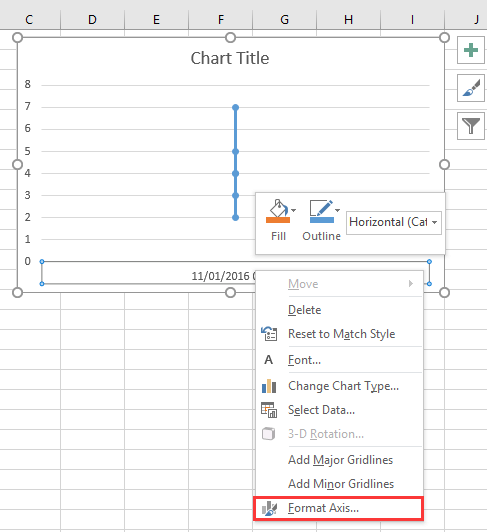
1. Højreklik på X-aksen i diagrammet, og vælg Formater akse fra genvejsmenuen. Se skærmbillede:
doc diagram med dato tid 2

2. Derefter i Formater akse rude eller Formater akse dialog under Aksemuligheder fanen, tjek Tekstakse valgmulighed i Aksetype afsnit. Se skærmbillede:
  doc diagram med dato tid 4
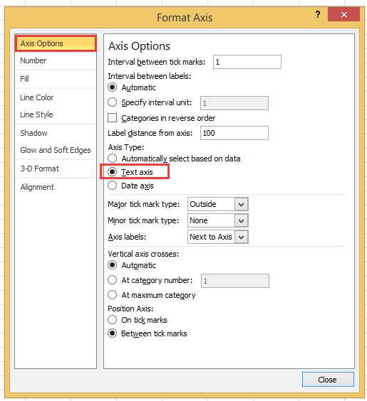
Hvis du bruger Excel-versionen senere end 2010, kan du se, at der vises en rude til formataks, og markere Tekstakse under Axis Type i Axis Options-gruppen.
doc diagram med dato tid 3

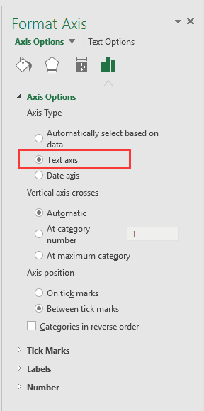
3. klik Luk eller gå tilbage til diagrammet, så er data og dato for data korrekt vist i X-aksen. Se skærmbillede:
doc diagram med dato tid 5


Opret et speedometer-diagram med to trin!

Nogle gange vil du måske bruge et speedometer-diagram til at vise prisfastsættelsen af ​​et projekt, men i Excel skal der oprettes et speedometer-diagram mange trin, som er komplekse og spilder tid. Her, den Hastighedsmåler diagram værktøj i Kutools til Excel kan hjælpe dig med at oprette et standardhastighedsmålerdiagram med to simpleste trin. Download dette værktøj med gratis 30-dages prøveversion nu.
doc hastighedsmåler diagram

Bedste kontorproduktivitetsværktøjer

🤖 Kutools AI Aide: Revolutionér dataanalyse baseret på: Intelligent udførelse   |  Generer kode  |  Opret brugerdefinerede formler  |  Analyser data og generer diagrammer  |  Aktiver Kutools funktioner...
Populære funktioner: Find, fremhæv eller identificer dubletter   |  Slet tomme rækker   |  Kombiner kolonner eller celler uden at miste data   |   Runde uden formel ...
Super opslag: VLookup med flere kriterier    Multiple Value VLookup  |   VOpslag på tværs af flere ark   |   Fuzzy Lookup ....
Avanceret rulleliste: Opret hurtigt rulleliste   |  Afhængig rulleliste   |  Multivælg rulleliste ....
Column Manager: Tilføj et bestemt antal kolonner  |  Flyt kolonner  |  Skift synlighedsstatus for skjulte kolonner  |  Sammenlign områder og kolonner ...
Fremhævede funktioner: Grid fokus   |  Designvisning   |   Stor Formel Bar    Arbejdsbog & Ark Manager   |  Ressourcebibliotek (Autotekst)   |  Datovælger   |  Kombiner regneark   |  Krypter/Dekrypter celler    Send e-mails efter liste   |  Superfilter   |   Specielt filter (filter fed/kursiv/gennemstreget...) ...
Top 15 værktøjssæt12 tekst Værktøjer (tilføje tekst, Fjern tegn, ...)   |   50 + Chart Typer (Gantt kort, ...)   |   40+ Praktisk formler (Beregn alder baseret på fødselsdag, ...)   |   19 Indsættelse Værktøjer (Indsæt QR-kode, Indsæt billede fra sti, ...)   |   12 Konvertering Værktøjer (Tal til ord, Valutaomregning, ...)   |   7 Flet og del Værktøjer (Avancerede kombinere rækker, Opdel celler, ...)   |   ... og mere

Overlad dine Excel-færdigheder med Kutools til Excel, og oplev effektivitet som aldrig før. Kutools til Excel tilbyder over 300 avancerede funktioner for at øge produktiviteten og spare tid.  Klik her for at få den funktion, du har mest brug for...

Beskrivelse


Fanen Office bringer en grænseflade til et kontor med Office, og gør dit arbejde meget lettere

  • Aktiver redigering og læsning af faner i Word, Excel, PowerPoint, Publisher, Access, Visio og Project.
  • Åbn og opret flere dokumenter i nye faner i det samme vindue snarere end i nye vinduer.
  • Øger din produktivitet med 50 % og reducerer hundredvis af museklik for dig hver dag!
Comments (23)
No ratings yet. Be the first to rate!
This comment was minimized by the moderator on the site
I have the same issue when graphing data that has date AND time: points on the graph are equally spaced, whereas the underlying data has unequal gaps between datapoints. Data is in the form "dd/mm/yyyy hh:mm" formatted as date/time (not text). Data spans multiple days so it's not possible to extract just the time element.
This comment was minimized by the moderator on the site
I have a chart with x-axis in time that stretches during about 6h and 35min. I have data for each 20min in the beginning, then 15min and lastly each 10min. Also, in between I have 45min and 5min data.. The issue that I have, and several others, is that each gap between the date are equally spaced out. Meaning that, even if it is only 5min the gap is the same as if it was 45min.
This comment was minimized by the moderator on the site
i want to make a line graph which contains thousand of entries it's included date, time, month and year, so please help me out.
This comment was minimized by the moderator on the site
Hi, syed Mubashir alam, I do not understand your quetion, if you just create a line graph and the x-axis contains month/day/year hour:minute as below screenshot shown:
https://www.extendoffice.com/images/stories/comments/sun-comment/line-chart-1.png
just follow above steps of the article. If your question is about the axis contents are to long, there is no good idea.
This comment was minimized by the moderator on the site
i want to make a line graph which contains thousands of entries including time, date, month and year but i couldn't make a line graph so please help me out.
This comment was minimized by the moderator on the site
It's good coment that point is not a comma. When you want to add more numericals numbers you should use comma in excel ;)
This comment was minimized by the moderator on the site
Excel menus have changed - this is an out of date article - please update for 2020 .. e.g where is AXIS TYPE now?
This comment was minimized by the moderator on the site
I did not found Excel 2020, just 365 2019, which menus are the same as 2013,2016 version.
This comment was minimized by the moderator on the site
How do I remove days that don't have data in them. Example 8/1-8/31 but not data was captured on 8/3 or 8/4, how do I remove those dates from my graph? They are not in my data table so why is it pulling them?
This comment was minimized by the moderator on the site
Open the Excel file that holds the chart from which you want to exclude dates. Click the X-axis, located underneath the chart, so that it becomes surrounded by a small box. Right-click inside the box and choose "Format Axis" from the popup menu. Click "Axis Options" on the left side of the "Format Axis" window. Locate the three "Axis Type" options in the middle of the screen on the right side of the window. Click the radio button next to "Text axis."
This comment was minimized by the moderator on the site
Hi, I have an issue here. When I opened "Format Axis" and "Axis Options", there is no "Axis Type" choice here
This comment was minimized by the moderator on the site
Hi, Agassi, which Excel version you use?
This comment was minimized by the moderator on the site
Easy, useful, but i didn't know. Thanks a lot
This comment was minimized by the moderator on the site
But it doesnt show them in right relation to eachother. For example 2 hours and 6 hours are same in chart..
This comment was minimized by the moderator on the site
Hi Kiwi, maybe you can paint a chart to show me what you want the chart show.
There are no comments posted here yet
Load More
Please leave your comments in English
Posting as Guest
×
Rate this post:
0   Characters
Suggested Locations